Evaluation Question 1: In what ways does your media product use, develop or challenge forms and conventions of real media products?
The genre of my music video is Pop. Pop music videos often run by the same conventions, often being about the artist to sell them.
The main convention followed, which also follows Goodwin’s theory for music videos, is the focus being on the main artist. Owen is the main character in my video, but is also the artist shown on the Digipak and advertisement. I kept to this convention and made him the centre of attention, and due to his age I believe the audience sympathised with his loss more.
Narratives or an upbeat colourful video. These two conventions never seem to be portrayed in the same sort of video. If the song is a fast paced, jolly song the music video tends to be more vibrant with bright colours and little narrative. An example of this can be seen through my music video analysis where I analysed Jessie J’s video ‘Price Tag’. In this video the narrative is not the main aspect. Contrastingly, Sam Smith’s ‘I know I’m not the only One’, which is also in the pop genre, is a more slow paced song with natural lighting and colours, which is portrayed through a narrative storyline as opposed to bright colours.
In my music video I used a narrative to portray the story of my artist, as the song I chose was a slower paced pop song with a lot of meaning behind it. I showed a more mellow mood by using dull colours and loss shown throughout the video to make the audience feel empathetic towards the main character. It follows the conventions of pop music videos that do have a story. I appropriately selected to do a narrative over a dance video due to the pacing of the song.
When a pop music video has a good narrative the editing isn’t very heavy effects wise and everything tends to look very natural. I obeyed this convention and tried to keep everything as genuine as possible, ranging from lighting to the costumes. This is similar with the use of digetic and non-digetic sound. Usually in pop music videos there is no diegetic sound when the music is playing. Within my music video I followed this rule, however I didn’t have any scenes with a lack of lyrics or music alongside them so non-diegetic sound wasn’t needed.
Another convention used within Pop Music, as stated in Goodwin’s theory. is that the video often matches the visuals. I did this through the literal portrayal of the song title “Photograph”. The whole meaning behind my video was to show the loss that the main character had undergone since his sister passed away. I had the photograph of the two of them pop up throughout the video, specifically at the end, to follow this convention. Another time this can be seen is the scene in the bathroom where the boy pulls a photo out his pocket. As this is happening the lyrics say “We keep this love in a photograph”, which matches the happy photo being shown on screen, then as the lyrics say “We make these memories for ourselves” the boy throws the photo on the floor to suggest that all the photo is is memories and is no longer there. Throughout the video the boy is constantly miserable which matches the opening line “Loving can hurt”. These shots specifically follow the convention that the visuals match the lyrics and add to the narrative.
One convention I didn’t follow was the popular use of lip syncing in pop music videos. Many Pop videos interconnect the lip syncing with the narrative, an example being Shawn Mendes’ ‘Treat You Better’, which I previously analysed. In this video Shawn sings along, whilst facing his turmoil, to portray his struggle and emphasize his emotion. In my music video I didn’t feel this was necessary as I wanted to the focus to be purely on the narrative. Shawn Mendes’ video is repetitive at parts with him singing towards to camera and I found that without the use of lip syncing the narrative progressed more, which benefited my video more.
Due to the absence of lipsyncing, something that both complies with and defies the conventions used in Pop music is the camera angles. The lack of lip syncing within my video meant the amount of artist close ups was minimum, which is a feature often used within Pop music videos. However, this didn’t mean I did not use them at all. When the main character is sitting on the wall contemplating whether or not to visit the grave he tilts his head back, as he did this I inserted a close up of his face to portray the emotion he is feeling. This is a convention often used in music videos of to show the emotions and expressions people are giving, but is often interlinked with lip syncing which I didn’t do.
I also included lots of panning shots, also similar to ‘Treat You Better’ , in order to make up for the lack of close up facial shots. Many of my panning shots were of the letters the main character wrote, which I used this way to portray the characters emotions and feeling by showing certain words. It was much more beneficial to add these panning shots as it set the tone of the scenes and progressed the story. Despite my lack of motifs and close ups I still kept the character relevant by only having him as the focus in the video.
Another convention that was benefited by the abstract camera angles was the cutting and transitions in the video. I tried to make parts of the video transition in time to the music which in turn progressed the story. One song I analysed that did this was “UGH” by the 1975. This convention is normally used in upbeat music videos, I do however think this was a good way of incorporating another aspect of pop music into my video as the jumpy movements almost added to the character’s feelings.
Evaluation Question 3- What have you learned from your audience feedback?
Before producing any of my products, I created a set of audience questionnaires in order to identify my target audience’s interests and construct my ancillary tasks and music video following the conventions of my genre. The questions as shown on screen are: (read screen)
My target audience, which I discovered using yougov.org and music map, was mostly females between the age of 14-25, but I found that some males also enjoyed certain songs from the Pop genre. Music Map also showed me similar artists to the ones I had researched.
From my research I found that my target audience prefers male artists such as Shawn Mendes, Ed Sheeran and the 1975 (an all male band). I took this in to consideration when I selected what song to use for my music video as the artist who sung it appealed more to the target audience.
After creating my video I handed out an audience questionnaire and had audience members write a paragraph to explain their thoughts on the video. I mainly asked my target audience of teenage females but also got the opinion of 1 male and one middle aged woman in order to have a variety of opinions.
I asked them all the same questions and the feedback I received allowed me to justify the choices I made for my music video.
The first question I asked was “Do you think the video fits the genre?”. I found 60 percent of the people I asked thought the video fits the genre. The other 40 percent were unsure. Out of this 40 percent half were my target audience which suggests that pop isn’t the main/only style of music video that enjoy. Despite the 40 percent that were unsure, I found that my music video did fit the genre and the conventions that I followed were successful in doing so.
This question went hand in hand with another question being “Do you think the narrative fits the song”. Everyone I asked loved the video and thought understood what the narrative was. They had no queries with the story not matching the song and thought both worked together well.
I also received feedback on what worked well in the video and what could be improved in the future. Nearly everyone I asked enjoyed the narrative and especially loved how the main actor portrayed the role. This was important as it reassured me that my lack of the use of lip syncing didn’t affect the overall outcome of the video. It also showed Goodwin’s theory of having the main singer on screen for the majority of the time was a good thing. The younger audience members questioned the age of the actor whilst the older ones felt more empathetic towards him.
I found that what most people commented on was the camera angles and transitions, such as the bottle smashing scene into the letter scene. Many people commented on how the close ups of the letter and individual words created an air of emotion that meant they empathized with the character more.
Subsequently, some people thought the time lapse could have been a bit better. I had the time lapse the way I did to portray how the outside world continued to go on whilst everything around the boy had seemingly stopped. This resulted in me finding from my feedback that being more literal with ideas in a pop music video is probably better than something a bit more abstract.
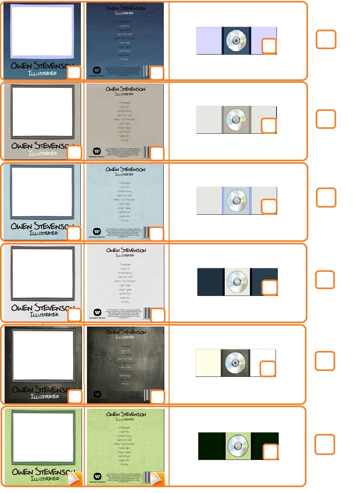
When designing my digipak I also received some audience feedback in order to select an appropriate colour scheme that would attract my target audience. I provided my audience with several different colour schemes I had designed and asked them to pick which colour they liked best for each section. I once again found that simple was better and black and white based colours with a bit of added texture were most popular. After this I designed my digipak based on the colours that had been shown to be most popular. From my feedback I found that the artist and the songs on the album are more important than the overall look when it comes to pop and as long as it doesn’t look over the top and ugly the audience will be more interested. My feedback confirmed my digipak research in that having a photo of the artist of and a simple design is very effective within the pop industry.
Evaluation Question 4- How did you use new media technologies in the construction and research, planning and evaluation stages?
Throughout the production of my media products I used many new media technologies to aid me.
The main piece of equipment I used whilst making my music video was Panasonic HC-V130 8.9 Mega Pixel camera. The camera quality could have been better but actually ended up beneffiting my music video. Ed Sheeran’s video of ‘Photograph’ has a grainy effect as it is focused on memories, similar to my video, so the grainy effect the camera created made it more atmospheric and emotional. The camera quality wasn’t so bad that it was un watchable either and one audience member, Elisabeth Hogarth, even commented saying the quality was really good for the sort of video I was trying to portray. The camera was basic to use, simply pressing on/off and then record/stop to film my shots. Similarly the camera screen was rotatable so I was able to see the shot from any angle as I filmed it. This definitely helped in the low angle shots.
I also used a tripod to keep the camera steady. It was easy to use as the legs were adjustable so I could extend or shorten them in order to keep the camera at the necessary height.
In order to transfer my recorded shots to the computer, I used a Lexar USB Card Reader which I had never used before. It was easy to use as you simply put the USB into the reader and but the reader into the computer. As I edited I saved my video on my USB Stick and the computer so I didn’t lose my work if either happened to get deleted.
After filming I edited my video clips together. I did this using Adobe PremierPro. This was also a very simple thing to use as once you get used to all the shortcuts and different areas on screen editing. The software allowed me to import clips, add or remove them as I pleased as well as cropping them, adding effects and editing the duration. In addition to this I could add music which was shown as a physical bar so I knew where I was at with each shot as I edited. Despite the easy access to everything I needed I did find that having the render the video every 20 or so minutes became quite frustrating. When a certain amount of clips were added to the video the software began to lag and the playbacks slowed down a considerable amount. In order to fix this you had to render effects in work area which, although made the video viewable, was annoying to have to repeat continuously.
My USB stick also allowed me to transfer my video to my home laptop and upload it to Youtube once my music video editing was complete. Youtube is a publicly accessable website meaning that once I uploaded any videos I could upload them to my blog without an issue. Not only did I use YouTube for uploading videos, but also research. This can be seen through my work such as my music video deconstructions. It provided me with a wide variety of videos to search and use.
Blogger was another technology I used whilst in production. Once I finished particular pieces of work I uploaded them to blogger, which is also easily accessed by the public and more specifically the examiners. Blogger allows you to make posts by adding text, pictures and videos. I uploaded pictures of my work I had saved on my memory stick and videos that I had uploaded in YouTube. Blogger also allows you to edit the layout of your blog by changing everything from the template to the the colour scheme to the colour of the font. Blogger was very helpful as it was good for storing work and keeping it in chronological order, showing how I progressed throughout my work.
Some of the work I uploaded to blogger was my Digipak and Magazine Advertisement. I made my digipak first using PagePlus. The first thing I did was have to option to choose the size of my page and the layout which was helpful for getting exact dimensions and keeping everything even. PagePlus didn’t have as many editing options as I would’ve liked and the tools where quite basic but it did provide you with a variety of different stencils and backgrounds that you could use to enhance your work. I used a chalkboard style background on my digipak which I found in the backgrounds sections of the assets folder. I used the cropping tool to change the size of the assets I used and the software also let me added and change the fonts I used. The software was much simpler than Photoshop but much faster.
Photoshop is another program I used. I used this for my magazine advertisement as I was more familiar with the program having used it once before. I first imported the picture I wanted to use and used the crop tool to make it the appropriate tool and crop out any negative space. I then made the image black and white and added the necessary text. Photoshop didn’t have an premade images to use like Pageplus but the layout of the software made it much easier to navigate and edit my advert.
Other software I used included programs such as Microsoft Word and Google Chrome. I used google chrome for research purposes and Microsoft word for typing up my findings and other work before transferring them to blogger.
I used a variety of different technology throughout my work and really enjoyed learning how to use them all. I found that I most enjoyed and succeeded in editing as it was very satisfying watching my work back that I had spent a long time making and being able to create something from scratch in my own way.