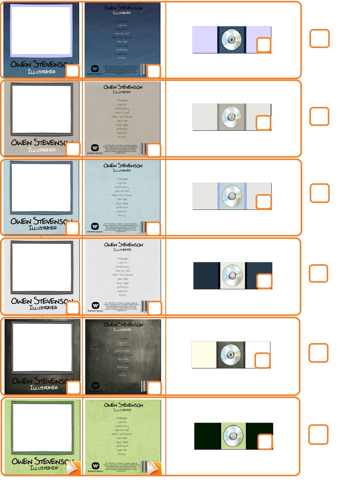
This is the final design for my 'Illustrated' digipak
Thursday, 19 January 2017
Wednesday, 18 January 2017
Audience Feeback
After showing my final music video I received some feedback from my audience members.
I asked them the following questions:
Do you think the video fits the genre?
Do you think the video matches the song?
What did you like about the video?
Do you think anything could be improved? If so what?
Do you think the video matches the song?
Matthew Stevenson:
17 Male
17 Male
Yes I do think the video fits the genre
I like the editing that was cut to the pace of the song. Good acting from the main actor. Interesting camera angles and shots used, which were very atmospheric.
The time lapse could have been a bit better in order to better show the passage of time and the camera quality could have been a bit better.
Elisabeth Hogarth:
40 Female
40 Female
I'm not sure if it fits the genre as I can't say I watch may music videos, however it is similar to the few pop style music videos I have seen, mostly due to the narrative. I really enjoyed the story-line and pacing which as a whole I thought was really great. The quality of the picture and the main actor, along with the interesting camera angles (specifically the close ups of the words) really added to the atmosphere and helped me get in to the story. I also liked how each camera angle lead into the next shot. My favourite scenes were the time-lapse at the beginning, where I enjoyed the cars and people walking past whilst nothing around the house changed, and the scene down the stairs as the light came through the curtain which made it very atmospheric.
All in all I really loved the video but maybe you could add a title?
Olivia Hogarth-Bartley:
20 Female
It was really good! I really loved the story and the narrative portrayed by the main actor. My only criticism was that he looked a bit young to be drinking alcohol, but it definitely added to the emotions portrayed and it began to make more sense as the story progressed.
Rosie Wallace:
18 Female
I do not really watch pop music as I prefer rock so I wouldn't be able to tell you if it fits the genre or not. The video was great overall. My favourite part was when he smashed the bottle and it transitioned into the bright light shining on the writing of the letters as it was if he realised he needed to do something to deal with his loss. The time-lapse at the beginning could of been better, at first I didn't realise it was a time-lapse
Paul Hogarth
Male
I posted my video in a Facebook group chat and received the following feedback from Paul Hogarth
Amy Talley:
17 Female
As I was filming Amy, I also asked her the question "Do you understand what story was being presented? What do you think it was?"
Below is a video of Amy Talley answering the questions after having watched the video:
Olivia Hogarth-Bartley:
20 Female
It was really good! I really loved the story and the narrative portrayed by the main actor. My only criticism was that he looked a bit young to be drinking alcohol, but it definitely added to the emotions portrayed and it began to make more sense as the story progressed.
Rosie Wallace:
18 Female
I do not really watch pop music as I prefer rock so I wouldn't be able to tell you if it fits the genre or not. The video was great overall. My favourite part was when he smashed the bottle and it transitioned into the bright light shining on the writing of the letters as it was if he realised he needed to do something to deal with his loss. The time-lapse at the beginning could of been better, at first I didn't realise it was a time-lapse
Paul Hogarth
Male
I posted my video in a Facebook group chat and received the following feedback from Paul Hogarth
Amy Talley:
17 Female
As I was filming Amy, I also asked her the question "Do you understand what story was being presented? What do you think it was?"
Below is a video of Amy Talley answering the questions after having watched the video:
All in all the feedback that I received for my music video was exceedingly positive.
A2 Media Music Video: Photograph by Ed Sheeran
This is my final music video cut for my chosen song, 'Photograph'
Thursday, 15 December 2016
Digipak Edits and Audience Questionnaire
After researching professionally made digipaks/CD packs I designed my own digipak for my artist, including songs, in a variety of colours.
Once I had made an array of colour combinations, I made a questionnaire in order to receive some audience feedback from my target audience. I did this as I wanted to know which sort of album would appeal most to the people that would potentially be buying it - allowing to make any necessary changes to my digipak before completion.
These are the questions I asked, along with providing pictures for each digipak.
Digipak Draft
This is the cover design I originally drew before digitally creating my Digipak.
This is my front cover I have designed for my digipak. I kept it quite simple, as do most pop albums, using a head shot of my artist/character, including his name and album title. I chose the name "Illustration" as I wanted the album to be an illustration of the artist's life. As it would be his debut album it would allow his audience to get to know him better. People often feel more endeared to buying something if they know more about it and the background behind it, hence my decision for this.
Here we have the back cover of my digipak design. Once again very simple, incorporating all the song titles that are featured on the album along with a music company logo, barcode and general information that is always shown on an album. I made up all the song names, barr "Photograph", which I listed as the first one shown. This was to make people continue reading after they see a song they are familiar with.
Next is the inside of the digipak
As it open's up you see one blank side and one side with a ripped up photograph on. This is in reference to my music video. It also reference's the song choice "Photograph". I kept the left side blank as Pop albums don't generally go over the top on decorating the inside, but rather pick a colour scheme. At the current time I have decided to pick black and white/cream as it is gender natural and can match any other colours I may want to add
On the inside I will keep the centre square black and the two side boxes white. I didn't feel it was necessary at all to over edit my digipak as that isn't a convention that is generally cosistent or popular in the pop genre.
This is my front cover I have designed for my digipak. I kept it quite simple, as do most pop albums, using a head shot of my artist/character, including his name and album title. I chose the name "Illustration" as I wanted the album to be an illustration of the artist's life. As it would be his debut album it would allow his audience to get to know him better. People often feel more endeared to buying something if they know more about it and the background behind it, hence my decision for this.
Here we have the back cover of my digipak design. Once again very simple, incorporating all the song titles that are featured on the album along with a music company logo, barcode and general information that is always shown on an album. I made up all the song names, barr "Photograph", which I listed as the first one shown. This was to make people continue reading after they see a song they are familiar with.
Next is the inside of the digipak
As it open's up you see one blank side and one side with a ripped up photograph on. This is in reference to my music video. It also reference's the song choice "Photograph". I kept the left side blank as Pop albums don't generally go over the top on decorating the inside, but rather pick a colour scheme. At the current time I have decided to pick black and white/cream as it is gender natural and can match any other colours I may want to add
On the inside I will keep the centre square black and the two side boxes white. I didn't feel it was necessary at all to over edit my digipak as that isn't a convention that is generally cosistent or popular in the pop genre.
Music Magazine Advertisement Draft
This is my draft design for my Magazine Advertisement.
I will be using a similar photo of my artist to the one used on my digipak, similar to artists such as Ed Sheeran and Shawn Mendes who have experience in the field of music and the same target audience as my artist.
As shown above the first thing that will be noticeable as you view the advertisement is the close up headshot of my artist. I want this to be the first thing seen as, not only is it a staple design feature used in most pop advertisements, it will allow the audience to see what the artist looks like. The artist will be smiling and look layed back, in order to make the audience feel comfortable and interested in him. If he was screaming for example it could put off some people and as soon as they look at the advertisement they would have a distaste for it. The artist will be wearing a smart shirt, whilst not having the top buttons done up to create a relaxed feeling and not to be to uptight.
The next noticeable thing is the artist's name. I plan to use a bold font, whilst not to aggressive as to suggest a more rock genre. I want it to look as if the writing was hand written, to match the idea of the album being illustrated. Bold artist names being noticeable are a big convention in pop music advertisements. Each artist seems to have their own distinguishable font used on their albums and advertisements, most noticeably artists such as Jessie J, making them unique. I want the illustrated idea to be that for my artist, without looking too unprofessional and messy
The other writing shown says "Illustrated" which is the album title, and "Hit Single 'Photograph' ". This is another convention I found whilst researching advertisements that pop artists generally use. By naming a popular, well known song featured on the album the target audience is more enticed into buying the album.
I will also include an image of my alum cover. This was only used on a few of the advertisements I researched but I believe it would attract the audience further and help them know what they should look out for.
At the top I have included a black information bar which will have the logo in one corner and all necessary information in the other. Although a bar wasn't used in many advertisement, I thought it made it look smarter and went along with my colour theme and kept the bottom of the page from looking too clustered. It prevents to much small print taking up unnecessary space, as many people don't read it.
Music Video Editing
Whilst editing my music video I took some screenshots, using the "Prnt Sc (Print Screen)" button, to show the process an explain how I did what I did. They are shown below.
My first screenshot is a zoomed out shot to present all the cuts I made to make the transitions between shots match the tempo and beats of the music. This was taken half way through editing so there was a lot more once I had finished. To the left you can see a list of images, these are the shots I imported in to the editing software from the camera. At the top right is a singular image of the main character walking. This allowed me to watch the video as I was editing to make sure everything was how I wanted it.
This second screenshot shows how I edited the song itself to shorter the duration of the video and trying to make sure the music still smoothly blended together. There was a segment of the song that increased the length whilst I had nothing to place in that area. The beats of the music around this area where duplicated from the previous line of lyrics so I removed this area. As it was repeated I was able to make the music smoothly continue without making it obvious some of the song had been cut out.
In this shot you can also set a closer up view of some of the cutting I did to make the transitions match the beats of the music
This clip shows a technique I used to edit the length of some shots. While for most shots I used the crop tool to edit the shots to my desired size, for some others I was able to drag the clip along when a red bar popped up as I scrolled my mouse over it. This allowed me to make the shot the exact length I needed it to be by re-adding cropped out areas.
The next tool I used was called "Scale to Frame Size". When imported in to the editing software the clips I had filmed were cropped to fit the size of the editing screen. By using the Scale to Frame Size tool, the shots returned to the original size and fitted everything in, rather than being cropped and missing out vital parts of the video. Scale to Frame size is found under the "Video Options" section in the "Clip" drop down bar.
This screenshot shows the tool I to create my time-lapse. The shot was originally 1 hour long but by increasing the speed on the editing software I was able to create a time-lapse and insert it at the beginning of my video. By increasing the speed from 100 to 10000 the clip almost doubled in speed, which I then cropped to fit the gap at the start of my music video.
Friday, 18 November 2016
Risk Assessment
During the filming of my music video, there may be some risks that could affect the actor and potentially harm them. I have thought about these in advance and will plan on taking the following precautions to assure that no one is injured during the filming of my music video.
The first risk I have assessed is the potentially unstable/ uneven ground at the grave yard. Due to the various graves that will be there, the ground will potentially be uneven
Magazine Advertisement Research
One of our ancillary tasks was to design and create our own magazine advertisement for our artist so before anything else I decided to do some research in to other magazine advertisements and posters from popular pop artists already in the industry.
The first magazine advertisement I looked into was Ed Sheeran's first album. I did this as I am using one of his songs for my music video and for my artist it would also be his debut album. Ed Sheeran's advertisement consists of a close up of him, his name and information such as his singles. The poster consists of two colours being his signature colour, orange, and white. However the picture of him is black and white which allows the writing to stand out. Out of all the writing on the advertisement the biggest and boldest is Ed Sheeran's name which portrays him as the most important. The poster also shows a wallet photo of his album cover, allowing people to know what to look out for.
The next advertisement I looked at is for Adele's album, 21. This advert is very minimal, with her name and album name being considerably bigger than Ed Sheeran's, once again being the biggest piece of text on the page. Once again the layout is very simple, with a close up backing shot of the artist, and writing in the foreground. The small writing underneath her name brings up the fact that she is a grammy award winner and also mentions one of her most popular singles, "Rolling in the Deep", similar to Ed Sheeran - expressing the quality of the artist. Also similar to Ed Sheeran's is a wallet sized photo of her album cover. The text "21" and "Available everywhere now" are in green font, unlike the rest of the advert, which makes them stand out more. The fact that it's "out now" along with the "21" suggests they want you to get it "now".
Above is the magazine advertisement for the Pop artist Jessie J. It is mainly composed of a detailed close up of the artist's face, along with her name and album title. The close up image is what first catches the audience's eye, which will be especially effective with artists familiar with the artist. One of Jessie J's main quirks is how unique her style is, which is shown through her haircut (her long fringe) and her bold colour choices, this occasion being black. The colours contrast the background making her stand out, whilst also contrasting the bold gold writing, making her name and other writing also stand out and easy to read. The writing is classy yet simple and gets across the most important information, being the debut album and a international best seller- "Price Tag", which also brings up another artist, being B.O.B, which will attract audience members from both artist's audiences.
For Olly Murs' advertisement his name is once again the biggest piece of text shown. It also, once again, consists of a big photo of him, this time however is a wider shot so his body is visible. This allows the audience to see what he is wearing and attracts his target audience, which is teenage girls, due to the suave and attractive tendencies of his photo. His gelled up hair, rolled up sleeves and hands in his pockets portray him a cool guy, which is generally attractive to teenage girls. The colours of the writing are made to match what he is wearing, as opposed to contrasting them similar to the previous adverts. This is probably done to contrast the background as no writing covers his body as well as emphasising the appeal to his target audience. Once again it shows another artist, to appeal to a wider audience, and the fact that one of his singles reached no.1 showing his quality as an artist.
The last artist I looked at was Shawn Mendes, which is the most minimal advert out of all the ones shown. It once again features a picture of him, but unlike Olly Murs does not show his whole body, despite their similar target audience. This suggests that despite their similar target audience, their songs are quite different. The colours are very basic and match his album cover, being black, white and blue, with the writing.
In conclusion the following conventions are normally used with a Pop Music poster/ magazine Advertisement-
-Clear Image of the Artist in the Background
-Artist Name - Biggest Writing
-Album Titles
-Minimal colour variety- Obvious Colour Scheme
-Hit Song Included
-Artist's Website
-Record Label Logo at the bottom
-Awards Won
In conclusion the following conventions are normally used with a Pop Music poster/ magazine Advertisement-
-Clear Image of the Artist in the Background
-Artist Name - Biggest Writing
-Album Titles
-Minimal colour variety- Obvious Colour Scheme
-Hit Song Included
-Artist's Website
-Record Label Logo at the bottom
-Awards Won
Monday, 7 November 2016
Album Cover Research
In order to create my digipak I needed to do some research in to how other mainstream pop artists compose their's. A digipak is styled packaging usually used for physically copies of CDs, the front cover is often also used for digital copies of albums. Digipaks often consist of information about the band, a CD and possibly song lyrics. The front cover normally shows something related to the artist/s, their name, the song or album title and possibly some artwork in the background. The inside then has the CD, possibly photos relating to the artist and then song lyrics or a leaflet with various information/more lyrics inside.
The first cover I looked at was Ed Sheeran's as he is the artist of the song I have chosen. His album cover is very simple and is just an orange picture of him, it is named after him and doesn't have an alternative title suggesting he wants the focus to be on him and his music. The little other writing on the cover shows the most popular songs on the album, which will capture the audience straight away as they won't have to check the back of the album to see if songs they like are inside. It also has a small promotion to entice you more, saying that if you put the CD in your computer you will unlock extra bonus content.
On the inside there is a removable leaflet, which is also attached to the front cover. Inside this leaflet is song lyrics to the songs on the album.The inside colours are once again black and white keeping it simple.
On the back of the digipak it is once again simple and includes the songs that on the album. This is helpful for when you want to buy the album as they are usually sealed and therefore you won't be able to look at the leaflet inside. There is also a barcode and the less important stuff in small writing as that isn't what the customer wants to see nor will it entice them in to buying it. This writing also includes his website, which isn't as small but isn't so large that its overly noticeable. It is bolder than the small writing so if the customer wishes to visit his website they won't miss it.
When I looked at digipaks I also looked at artists similar to the artist who's song I have picked. One of the digipak covers have looked at is Justin Beiber, a popular pop artist who is appealing to my target audience. His cover consists of a photo of him with his head down and his hands together, he looks pretty relaxed. The album cover itself has quite a few different patterns over it but in all is quite a simple design. The colours are blue, grey and white, with Justin himself also being black and white which makes the album seem pretty relaxed and calm. The patterns over him are prominent whilst not taking away from the fact the Justin is on the cover as well. The writing on the cover is quite stylised which makes it hard to read. It matches the colour scheme and is once again simple, being one word "Purpose". This adds to the thoughtful and simple effect the album gives off. The title has been placed at the bottom of the cover and I didn't notice it at first, which suggests the creator of the cover wanted to portray Justin more than the title, which makes sense as he is a very popular artist.
The first cover I looked at was Ed Sheeran's as he is the artist of the song I have chosen. His album cover is very simple and is just an orange picture of him, it is named after him and doesn't have an alternative title suggesting he wants the focus to be on him and his music. The little other writing on the cover shows the most popular songs on the album, which will capture the audience straight away as they won't have to check the back of the album to see if songs they like are inside. It also has a small promotion to entice you more, saying that if you put the CD in your computer you will unlock extra bonus content.
On the inside there is a removable leaflet, which is also attached to the front cover. Inside this leaflet is song lyrics to the songs on the album.The inside colours are once again black and white keeping it simple.
When I looked at digipaks I also looked at artists similar to the artist who's song I have picked. One of the digipak covers have looked at is Justin Beiber, a popular pop artist who is appealing to my target audience. His cover consists of a photo of him with his head down and his hands together, he looks pretty relaxed. The album cover itself has quite a few different patterns over it but in all is quite a simple design. The colours are blue, grey and white, with Justin himself also being black and white which makes the album seem pretty relaxed and calm. The patterns over him are prominent whilst not taking away from the fact the Justin is on the cover as well. The writing on the cover is quite stylised which makes it hard to read. It matches the colour scheme and is once again simple, being one word "Purpose". This adds to the thoughtful and simple effect the album gives off. The title has been placed at the bottom of the cover and I didn't notice it at first, which suggests the creator of the cover wanted to portray Justin more than the title, which makes sense as he is a very popular artist.
The next album I looked at was "Handwritten" by Shawn Mendes. Once again, similar to Ed Sheeran's and Justin Beiber's, it consists of a photo of Shawn in the centre, with simple colour and other things going on, but not enough to take the focus of the artist himself. Very similar to Justin Beiber's, their is writing/ patterns surrounding him, which looks as if it was written on a chalkboard. In this case it is appropriate as the album is called "Handwritten". The title itself includes his name and the name of the album, with his name being bigger and a bolder colour than the title. The style of the handwritten writing on the chalkboard is quite messy and matches that of the writing on the back cover. This consists of the songs in the album, a barcode and then copyright and dedications etc in small below. Once again the album colours are blue, black and white which gives it a clean finish and allows for certain parts to be prominent.
By researching these digipaks/albums I have realised that nearly all, if not all, pop artist's albums follow the same conventions with a simple design including a picture of themselves, a back cover with the song included and little else and bold colour choices which all go together and capture the audience's eye.
Subscribe to:
Posts (Atom)